

This is the story of how I got into the idea of making a personal website.
Why
After making my first few websites, I wanted something to show off my "skills". I then proceeded to make my now "old" website and learned Angular through that. Then at the beginning of this year, I decided that I want to/at least try to redesign my personal website every year.
How
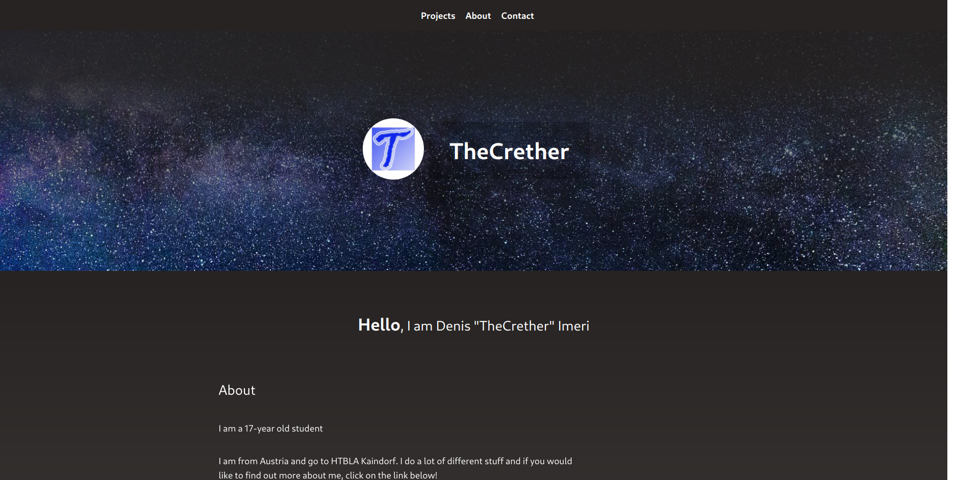
For this year's website (2020), I started with a simple Figma sketch and figuring out the fonts to use. In the end I did not use the fonts that I selected because I found the fonts that were used in the Next.js tutorial. That brings me to the technologies used. This project is pretty much only Next.js with a modified config for optimizing images, using autoprefixer and using ts-paths (stuff like @components when importing).
I first did all of the Next.js tutorial and then thought about the structure of how I wanted to build the components/pages etc. At first I only thought about three pages, Homepage, Projects and About. After some thinking, I decided to add a contact page.
In terms of keeping track of my ideas and issues that had to be fixed, I used Trello because I want to use it more to better organize my projects and always know if there is something to do. I just used basic labels for "TODO", "In Progress" and "Done" and also used the free Butler automation stuff.
Then it just came to thinking of ideas and implementing them. This happened in the span of around 3 weeks, I think. Most of the work at the beginning was foundational stuff and not really much content. One design feature that I found pretty cool, is on the Projects page, and its a so-called "marquee" effect. Credit goes to this article written by Mary Lou on tympnanus.net.
One design aspect which was very important for me, was that there were not too many animations, but still some fancy animations. The last thing I want to talk about, is optimisation for the phone, which is a must in my opinion. Websites that don't understand the importance of mobile layouts or the concept of using space well (i.e. sites that use only fixed values). That's why I used a lot of flexbox and relative values/flex-grow to make it as responsive as possible.
Conclusion
This was another project which was very fun for me, especially because I just like designing in general. I had not designed on my own for a little more than half a year at that point and I liked it very much because I could incorporate everything that I wanted to. Hopefully I can keep up with redesigning my website every year because I already have a lot of ideas for the next one after seeing some very nice portfolios from other developers. Stay tuned!